So You Want to Write Like an Architect: Architectural Lettering
Practice your architectural lettering if you want to write like an architect!
Let’s explore the origins of architectural lettering and discuss why architectural lettering is still valuable today.
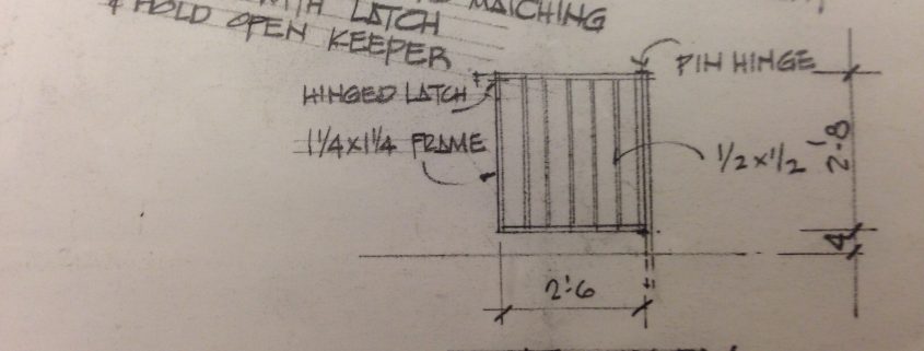
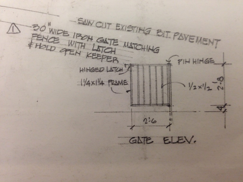
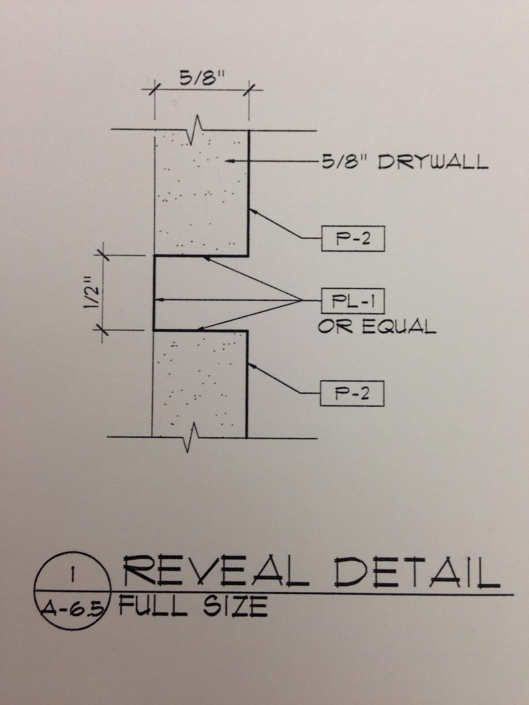
Architectural lettering has been an important tool of architects for many years. Here’s why: architect’s use drawings and specifications to convey written information on architectural drawings. These drawings are used by the contractor to build the architect’s vision. If the contractor misreads the architect’s intent, it could spell dire consequences for the building project; safety issues, project delays, and cost-overruns could be the result.
Think of the Bible story of the Tower of Babel. People were communicating but they were not speaking the same language. As a result, their communication was confused and ineffective. That’s how it is with writing: if you write in script, italics, or upper and lower case, you may find that your audience is confused and your communication may be ineffective.
By using architectural lettering, with its characteristic uniform, neat block letters, the architect’s words can be clearly read by everyone. There is no ambiguity. All of the building trades can rely on clearly written lettering on the drawings to guide them in their work.
In the past, the lettering was done by hand and architecture students spent hours slaving away at the drafting board to learn the proper lettering technique. Using a T-square or parallel rule and a lettering guide or triangle to guide them, students drew very light horizontal guidelines and then painstakingly formed the letters. I remember having hand cramps while learning the technique necessary to achieve a consistent lettering style, while in architecture school at the University of Illinois.
Even today, architectural lettering is still used on our computer generated architectural drawings. So what makes architectural lettering different from other forms of typography?
Essential Features of Architectural Lettering
Legible
Consistent font
Readable, consistent font size
No seraphs
No overlapping letters
Evenly spaced
All upper case letters
Black
Architectural lettering is still valuable today because it promotes clear communication and makes a critical difference in conveying the architect’s vision. If you want to convey your ideas clearly, write like an architect!


